Explaining Machine Learning Predictions: LIME and Counterfactuals
Tutorial Contents
In this tutorial, we look at explaining predictions of a machine learning model with counterfactuals and Local Interpretable Model-agnostic Explanations (LIME). We explain how to use these tools and point out what the user should consider when interpreting their output. We also show the importance of data density when judging reliability of the explanations.
To start with, let us load all the external dependencies and the Iris data set, which we will use for this tutorial:
>>> import numpy as np
>>> import matplotlib.pyplot as plt

>>> from pprint import pprint

>>> import fatf

>>> import fatf.utils.data.datasets as fatf_datasets
>>> iris_data_dict = fatf_datasets.load_iris()
>>> iris_data = iris_data_dict['data']
>>> iris_feature_names = iris_data_dict['feature_names']
>>> iris_target = iris_data_dict['target'].astype(int)
>>> iris_target_names = iris_data_dict['target_names']
Throughout the tutorial we will need to print some of the data points in a human-readable format. To make that easier let us define a function that will do that for us:
>>> def describe_data_point(data_point_index):
...     """Prints out a data point with the specified given index."""
...     dp_to_explain = iris_data[data_point_index, :]
...     dp_to_explain_class_index = iris_target[data_point_index]
...     dp_to_explain_class = iris_target_names[dp_to_explain_class_index]
...
...     feature_description_template = '    * {} (feature index {}): {:.1f}'
...     features_description = []
...     for i, name in enumerate(iris_feature_names):
...         dsc = feature_description_template.format(
...             name, i, dp_to_explain[i])
...         features_description.append(dsc)
...     features_description = ',\n'.join(features_description)
...
...     data_point_description = (
...         'The data point with index {}, of class {} (class index {}) '
...         'has the\nfollowing feature values:\n{}.'.format(
...             data_point_index,
...             dp_to_explain_class,
...             dp_to_explain_class_index,
...             features_description))
...
...     print(data_point_description)
We also need a predictive model, which predictions we will try to explain:
>>> import fatf.utils.models as fatf_models
>>> clf = fatf_models.KNN()
>>> clf.fit(iris_data, iris_target)
To finalise the setup, we need to choose a few data points to explain. For the purposes of this tutorial, we will choose three data points one of each class. Given that the data points are ordered by class and there are 50 samples of each class, we will use data points with indices 24, 74 and 124:
>>> index_setosa = 24
>>> x_setosa = iris_data[index_setosa, :]
>>> y_setosa = iris_target[index_setosa]
>>> describe_data_point(index_setosa)
The data point with index 24, of class setosa (class index 0) has the
following feature values:
    * sepal length (cm) (feature index 0): 4.8,
    * sepal width (cm) (feature index 1): 3.4,
    * petal length (cm) (feature index 2): 1.9,
    * petal width (cm) (feature index 3): 0.2.
>>> iris_target_names[clf.predict(x_setosa.reshape(1, -1))[0]]
'setosa'

>>> index_versicolor = 74
>>> x_versicolor = iris_data[index_versicolor, :]
>>> y_versicolor = iris_target[index_versicolor]
>>> describe_data_point(index_versicolor)
The data point with index 74, of class versicolor (class index 1) has the
following feature values:
    * sepal length (cm) (feature index 0): 6.4,
    * sepal width (cm) (feature index 1): 2.9,
    * petal length (cm) (feature index 2): 4.3,
    * petal width (cm) (feature index 3): 1.3.
>>> iris_target_names[clf.predict(x_versicolor.reshape(1, -1))[0]]
'versicolor'

>>> index_virginica = 124
>>> x_virginica = iris_data[index_virginica, :]
>>> y_virginica = iris_target[index_virginica]
>>> describe_data_point(index_virginica)
The data point with index 124, of class virginica (class index 2) has the
following feature values:
    * sepal length (cm) (feature index 0): 6.7,
    * sepal width (cm) (feature index 1): 3.3,
    * petal length (cm) (feature index 2): 5.7,
    * petal width (cm) (feature index 3): 2.1.
>>> iris_target_names[clf.predict(x_virginica.reshape(1, -1))[0]]
'virginica'
Counterfactual Explanations
A counterfactual explanation attempts to identify the smallest (according to an arbitrary distance metric) possible change in the feature vector that causes a data point to be classified differently to its original prediction. Before we can generate any counterfactual explanation we need to initialise a counterfactual explainer:
>>> import fatf.transparency.predictions.counterfactuals as fatf_cf
>>> iris_cf_explainer = fatf_cf.CounterfactualExplainer(
...     model=clf,
...     dataset=iris_data,
...     categorical_indices=[],
...     default_numerical_step_size=0.1)
Now, let us see how we can modify our setosa data point for it to be classified as one of the other two classes:
>>> setosa_cfs = iris_cf_explainer.explain_instance(x_setosa)
>>> setosa_cfs_data = setosa_cfs[0]
>>> setosa_cfs_distances = setosa_cfs[1]
>>> setosa_cfs_predictions = setosa_cfs[2]
Let us inspect the distances of the counterfactual data points:
>>> setosa_cfs_distances
array([1.20000002, 1.20000002, 1.20000003, 1.20000012, 1.20000012,
       1.20000012, 1.20000012, 2.50000009, 2.50000009, 2.50000009,
       3.4       ])
The first 7 counterfactuals are within the same 1.2 distance, the next 3 are within 2.5 distance and the last one is 3.4 away. (The default distance metric is the Euclidean distance.)
Now, let us have a look at the predicted class of these counterfactual instances:
>>> setosa_cfs_predictions
array([1, 1, 1, 1, 1, 1, 1, 1, 1, 1, 1])

>>> iris_target_names[1]
'versicolor'
All of the counterfactual instances are of versicolor class (class index 1) as opposed to setosa – the ground truth label the of data point we are trying to explain. One may conclude that setosa type (or at least this instance of setosa) is more similar to versicolor than virginica.
Finally, let us see the feature values of the counterfactual data points:
>>> setosa_cfs_data
array([[4.80000019, 3.4000001 , 3.1       , 0.2       ],
       [4.80000019, 3.4000001 , 3.1       , 0.2       ],
       [4.80000019, 3.4000001 , 3.1       , 0.2       ],
       [4.80000019, 3.1       , 2.8       , 0.2       ],
       [4.80000019, 3.2       , 2.9       , 0.2       ],
       [4.80000019, 3.3       , 3.        , 0.2       ],
       [4.80000019, 3.4       , 3.1       , 0.2       ],
       [4.80000019, 2.        , 1.89999998, 1.3       ],
       [4.80000019, 2.1       , 1.89999998, 1.4       ],
       [4.80000019, 2.2       , 1.89999998, 1.5       ],
       [5.90000019, 3.4000001 , 1.89999998, 2.5       ]])
Note
The small differences in some of the features and duplicated counterfactual
data points are due to numerical instabilty of floating point numbers and
have nothing to do with the counterfactuals. This can be resolved with
numpy.around:
>>> setosa_cfs_data_around = np.around(setosa_cfs_data, decimals=2)
>>> setosa_cfs_data_around
array([[4.8, 3.4, 3.1, 0.2],
       [4.8, 3.4, 3.1, 0.2],
       [4.8, 3.4, 3.1, 0.2],
       [4.8, 3.1, 2.8, 0.2],
       [4.8, 3.2, 2.9, 0.2],
       [4.8, 3.3, 3. , 0.2],
       [4.8, 3.4, 3.1, 0.2],
       [4.8, 2. , 1.9, 1.3],
       [4.8, 2.1, 1.9, 1.4],
       [4.8, 2.2, 1.9, 1.5],
       [5.9, 3.4, 1.9, 2.5]])
With the original data point having the following feature values
[4.8, 3.4, 1.9, 0.2], the first counterfactual data point looks the
most promising. We can print it in a more human-readable format:
>>> best_cfs_index = [0]
>>> selected_setosa_cfs_data = setosa_cfs_data_around[best_cfs_index, :]
>>> selected_setosa_cfs_predictions = setosa_cfs_predictions[best_cfs_index]
>>> selected_setosa_cfs_distances = setosa_cfs_distances[best_cfs_index]

>>> setosa_cfs_0_text = fatf_cf.textualise_counterfactuals(
...     x_setosa,
...     selected_setosa_cfs_data,
...     instance_class=y_setosa,
...     counterfactuals_distances=selected_setosa_cfs_distances,
...     counterfactuals_predictions=selected_setosa_cfs_predictions)
>>> print(setosa_cfs_0_text)
Instance (of class *0*):
[4.8 3.4 1.9 0.2]

Feature names: [0, 1, 2, 3]

Counterfactual instance (of class *1*):
Distance: 1.2000000238418598
    feature *0*: *4.800000190734863* -> *4.8*
    feature *1*: *3.4000000953674316* -> *3.4*
    feature *2*: *1.899999976158142* -> *3.1*
    feature *3*: *0.20000000298023224* -> *0.2*
Therefore, by changing the feature with index 2 – petal length (cm) – from 1.9 to 3.1, this instance of setosa (0) is being classified as versicolor (1).
Explanation Reliability
This explanation may be appealing, however the counterfactual data points may not always be reliable or outright impossible to achieve in real life. Imagine a dataset where one of the features is age and the counterfactual explanation is conditioned on the age being more than 200. This particular unreliability is easy to spot, however some of these feature changes may be subtle and difficult to validate. To address this issue we may resort to data density estimation and checking whether the counterfactual data point lies in a dense region.
Let us evaluate the density score of this counterfactual data point and see whether it is reliable:
>>> import fatf.utils.data.density as fatf_density

>>> iris_density = fatf_density.DensityCheck(iris_data)
>>> setosa_cf_density_0 = iris_density.score_data_point(
...     selected_setosa_cfs_data[0, :])
>>> setosa_cf_density_0
1
The high density score for the counterfactual point – 1.0 – indicates that this data point lies in a region of low density, therefore such a data point may not be feasible in the real life. For comparison, let us see what is the density score for the original setosa data point:
>>> setosa_density = iris_density.score_data_point(x_setosa)
>>> setosa_density
0.28479221999754833
This data point is obviously in a relatively dense region. To put these two density scores in a perspective, let us compute the average density score for all the 150 data points in the Iris data set:
>>> density_scores = []
>>> for i in iris_data:
...     density_score = iris_density.score_data_point(i)
...     density_scores.append(density_score)
>>> np.mean(density_scores)
0.27296921560737636
>>> np.std(density_scores)
0.1704851801007168
Therefore, the counterfactuals is very unlikely to appear in the real world. Please note that computing the average density score for a data set may not always be possible in practice for a whole dataset as it is computationally expensive.
To justify these scores let us try to plot the whole Iris data set alongside the counterfactual data point. To this end, we will plot the feature with index 2 against the remaining 3 features on separate 2-dimensional scatter plots:
>>> feature_other = 0
>>> feature_counterfactual = 2

>>> plot_02 = plt.figure()
>>> _ = plt.scatter(
...     iris_data[0:50, feature_other],
...     iris_data[0:50, feature_counterfactual],
...     label=iris_target_names[0])
>>> _ = plt.scatter(
...     iris_data[50:100, feature_other],
...     iris_data[50:100, feature_counterfactual],
...     label=iris_target_names[1])
>>> _ = plt.scatter(
...     iris_data[100:150, feature_other],
...     iris_data[100:150, feature_counterfactual],
...     label=iris_target_names[2])
>>> _ = plt.scatter(
...     x_setosa[feature_other],
...     x_setosa[feature_counterfactual],
...     s=100,
...     marker='X',
...     label='To explain')
>>> _ = plt.scatter(
...     selected_setosa_cfs_data[0, feature_other],
...     selected_setosa_cfs_data[0, feature_counterfactual],
...     s=100,
...     marker='X',
...     label='Counterfactual')
>>> _ = plt.title('Iris data set scatter plot')
>>> _ = plt.xlabel(iris_feature_names[feature_other])
>>> _ = plt.ylabel(iris_feature_names[feature_counterfactual])
>>> _ = plt.legend(loc='lower right')
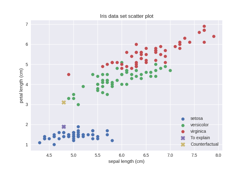
Interestingly, the counterfactual data point seems to be in a dense region. However, these are just 2 of the 4 dimensions. Our best guess is that this counterfactual data point is actually in a sparse region in the remaining 2 dimensions. Let us check that:
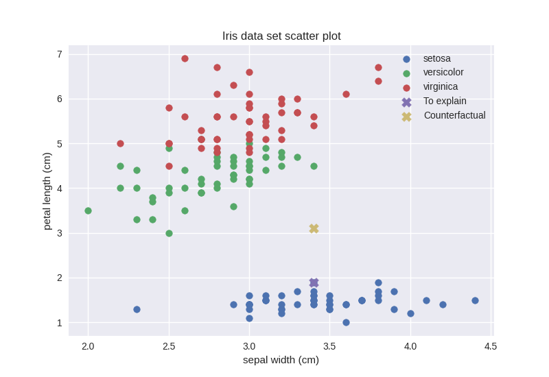
>>> feature_other = 1
>>> feature_counterfactual = 2

>>> plot_12 = plt.figure()
>>> _ = plt.scatter(
...     iris_data[0:50, feature_other],
...     iris_data[0:50, feature_counterfactual],
...     label=iris_target_names[0])
>>> _ = plt.scatter(
...     iris_data[50:100, feature_other],
...     iris_data[50:100, feature_counterfactual],
...     label=iris_target_names[1])
>>> _ = plt.scatter(
...     iris_data[100:150, feature_other],
...     iris_data[100:150, feature_counterfactual],
...     label=iris_target_names[2])
>>> _ = plt.scatter(
...     x_setosa[feature_other],
...     x_setosa[feature_counterfactual],
...     s=100,
...     marker='X',
...     label='To explain')
>>> _ = plt.scatter(
...     selected_setosa_cfs_data[0, feature_other],
...     selected_setosa_cfs_data[0, feature_counterfactual],
...     s=100,
...     marker='X',
...     label='Counterfactual')
>>> _ = plt.title('Iris data set scatter plot')
>>> _ = plt.xlabel(iris_feature_names[feature_other])
>>> _ = plt.ylabel(iris_feature_names[feature_counterfactual])
>>> _ = plt.legend(loc='upper right')
>>> feature_other = 3
>>> feature_counterfactual = 2

>>> plot_32 = plt.figure()
>>> _ = plt.scatter(
...     iris_data[0:50, feature_other],
...     iris_data[0:50, feature_counterfactual],
...     label=iris_target_names[0])
>>> _ = plt.scatter(
...     iris_data[50:100, feature_other],
...     iris_data[50:100, feature_counterfactual],
...     label=iris_target_names[1])
>>> _ = plt.scatter(
...     iris_data[100:150, feature_other],
...     iris_data[100:150, feature_counterfactual],
...     label=iris_target_names[2])
>>> _ = plt.scatter(
...     x_setosa[feature_other],
...     x_setosa[feature_counterfactual],
...     s=100,
...     marker='X',
...     label='To explain')
>>> _ = plt.scatter(
...     selected_setosa_cfs_data[0, feature_other],
...     selected_setosa_cfs_data[0, feature_counterfactual],
...     s=100,
...     marker='X',
...     label='Counterfactual')
>>> _ = plt.title('Iris data set scatter plot')
>>> _ = plt.xlabel(iris_feature_names[feature_other])
>>> _ = plt.ylabel(iris_feature_names[feature_counterfactual])
>>> _ = plt.legend(loc='lower right')
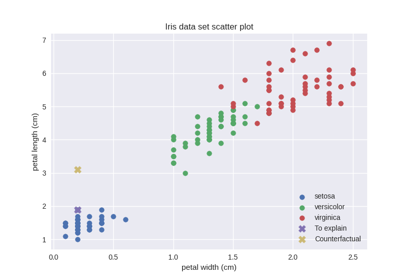
We were right, the counterfactual data point actually lies in a sparse region. Given our observations, however, if we just consider features with indices 0 (sepal length) and 2 (petal length) our counterfactual should be in a relatively dense region. Let us check that out:
>>> iris_02_density = fatf_density.DensityCheck(iris_data[:, [0, 2]])
>>> setosa_02_cf_density_0 = iris_02_density.score_data_point(
...     selected_setosa_cfs_data[0, [0, 2]])
>>> setosa_02_cf_density_0
1
Surprisingly, even when just considering the two feature that make the counterfactual data point look like it lies in a dense region the density score is still very high. Let us see what is the density score of the setosa data point when we only consider these two features:
>>> setosa_02_density = iris_02_density.score_data_point(x_setosa[[0, 2]])
>>> setosa_02_density
0.3279784272174436
0.33 seems to be reasonable as opposed to 1, which the counterfactual data point got when only considering the 2 feature that makes it lie in a relatively dense region. Let us revise the scatter plot.
This figure is clearly inconsistent with the density score. However, a closer
look at the default parameters of the
fatf.utils.data.density.DensityCheck class provide some explanation.
In particular the neighbours parameter, which default value is 7. This
means that local density is evaluated based on the 7 closest data points. The
setosa data point has more than 7 close neighbours, however the counterfactual
data point has only 4. To validate this intuition, let us revise the density
scores with the neighbours parameter set to 4:
>>> iris_02_density_n4 = fatf_density.DensityCheck(
...     iris_data[:, [0, 2]], neighbours=4)

>>> setosa_02_density_n4 = iris_02_density_n4.score_data_point(
...     x_setosa[[0, 2]])
>>> setosa_02_density_n4
0.2936750587688127

>>> setosa_02_cf_density_0_n4 = iris_02_density_n4.score_data_point(
...     selected_setosa_cfs_data[0, [0, 2]])
>>> setosa_02_cf_density_0_n4
0.5098398837987844
We were right! A clear message stemming from this peculiar example is that this
particular density estimation is sensitive, and somehow fragile, to the
definition of the neighbourhood and the neighbours parameters should be set
by the user based on his experience and knowledge of the data set rather than
left with the default value.
Counterfactual Fairness
Now that we have seen how counterfactual explanations work, it is worth
pointing out that the same mechanism can be used to investigate individual
fairness. By checking whether a prediction for an individual would change
had we altered one of the protected attributes like gender, marital status or
race. By setting the counterfactual_feature_indices parameter of the
fatf.transparency.predictions.counterfactuals.CounterfactualExplainer
class we can control which features will be modified in the counterfactual
example. Therefore, we can include and exclude features to be used for
conditioning the counterfactual explanation, hence use it to evaluate
individual fairness.
LIME
In addition to counterfactual explanations we also have an implementation of the Local Interpretable Model-agnostic Explanations (LIME). Let us see what LIME can tell us about our predictive model’s behaviour in the neighbourhood of our setosa data point:
>>> fatf.setup_random_seed(42)
>>> import fatf.transparency.predictions.surrogate_explainers as surrogates

>>> iris_lime = surrogates.TabularBlimeyLime(
...     iris_data,
...     clf,
...     feature_names=iris_feature_names.tolist(),
...     class_names=iris_target_names.tolist())
>>> lime_explanation = iris_lime.explain_instance(
...     x_setosa, samples_number=500)
Let us first have a look at the text version of our LIME explanation for the setosa data point:
>>> pprint(lime_explanation)
{'setosa': {'*petal width (cm)* <= 0.30': 0.03698295125607895,
            '*sepal length (cm)* <= 5.10': 0.013734230852263654,
            '1.60 < *petal length (cm)* <= 4.35': -0.18301541432210996,
            '3.30 < *sepal width (cm)*': 0.08821105886209096},
 'versicolor': {'*petal width (cm)* <= 0.30': 0.05771468585613034,
                '*sepal length (cm)* <= 5.10': 0.025733500528816115,
                '1.60 < *petal length (cm)* <= 4.35': 0.4694710470975027,
                '3.30 < *sepal width (cm)*': -0.00246315406456463},
 'virginica': {'*petal width (cm)* <= 0.30': -0.09469763711220923,
               '*sepal length (cm)* <= 5.10': -0.03946773138107974,
               '1.60 < *petal length (cm)* <= 4.35': -0.28645563277539254,
               '3.30 < *sepal width (cm)*': -0.08574790479752634}}
With all these numbers it may actually be easier to interpret their
visualisation, which we can generate using the built-in
fatf.vis.lime.plot_lime plotting function:
>>> import fatf.vis.lime as fatf_vis_lime

>>> lime_fig_setosa = fatf_vis_lime.plot_lime(lime_explanation)
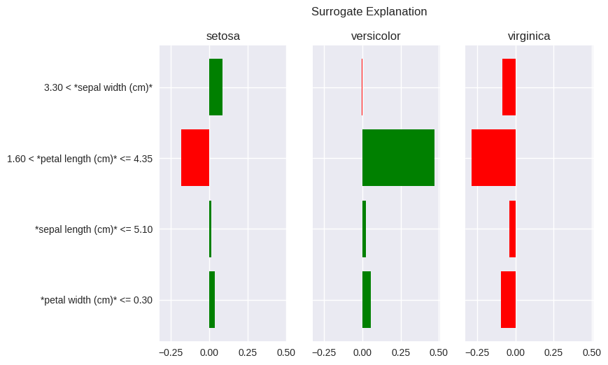
The setosa data point that we are trying to explain with LIME has petal width of 0.2 and petal length of 1.9. The LIME explanation for the setosa class – the leftmost pane – clearly shows that the reason for setosa prediction, in this instance (remember that LIME explanations are specific to a data point), is petal width not larger than 0.30 and petal length between 1.60 and 4.35. The first condition of these conditions can be understood as: “for the bar in the above plot, the vast majority (all of them in this case) of instances placed to the left of the 0.3 threshold on the petal width axis (x-axis) are of class setosa. The latter condition can be understood as: “the petal length between 1.6 and 4.35 indicates against the setosa class as most of the data points in this feature band are of a different class”. In the latter case a closer look at the scatter plot placed above shows that most of the data points in that band are of versicolor (green) class, which is clearly indicated by the high, positive value of this explanatory feature for the versicolor class in the LIME explanation.
One may wander why these particular feature thresholds (bands) were chosen for the LIME explanation. Especially that they seem suboptimal for this example. This is due to the explanatory representation of the data (the thresholds) being generated based on the whole data set rather than the instance that is being explained. Furthermore, the randomness of the explanation mentioned in the note above may seem like a strong disadvantage with the LIME algorithm, especially when considering robustness and reproducibility. Finally, some may realise that the explanatory feature ranges used by LIME merely highlight the hypercube in which the explained data point lies with their assigned importances merely showing which one is the best predictor (purest hyperspace) for a given class. These are all valid criticisms, which we discuss in more details in the User Guide. As a final remark it suffices to say that the bLIMEy approach implemented by this package fixes all of the aforementioned shortcomings.
In this tutorial we have worked through two different approaches to explaining predictions of a machine learning model: counterfactuals and LIME. Furthermore, we showed the importance of data density when evaluating quality of a counterfactual explanation. Last but not least, we showed how a counterfactual explanation can be used to evaluate individual (counterfactual) fairness.
This tutorial only covered transparency of machine learning predictions. To learn more about data set transparency please refer to the Using Grouping to Inspect a Data Set – Data Transparency section of the Exploring the Grouping Concept – Defining Sub-Populations tutorial. Predictive model transparency introduction is provided by the previous tutorial.
Relevant FAT Forensics Examples
The following examples provide more structured and code-focused use-cases of the counterfactuals, LIME and data density functionality:

